Do you want to learn how to draw a seascape with pastels? Well, you are in for a beautiful voyage of artistic expression. A seascape may not seem like the most complicated subject matter for a pastel painting, but if you create a unique composition with the right color combinations, you could end up with a stunning Drawing.
Drawing a Seascape in Oil Pastel?
How to Draw a Seascape in Oil Pastel? To Draw a seascape in oil pastels you will need to follow the following methods.
- Draw the sea of direct observation
- Draw from a photograph
- Draw the main outlines of the sea, waves and the horizon
- Observe the shape of the waves
- Pastels: Things you need to know
- Blending colors light to dark
- Using a paper template to create precise edges
- Organize your colors
- Organizing and using cool and cols colors
- Combining and applying hot and warm colors
- Applying tints and shade to color
- Learn how to blend oil pastels
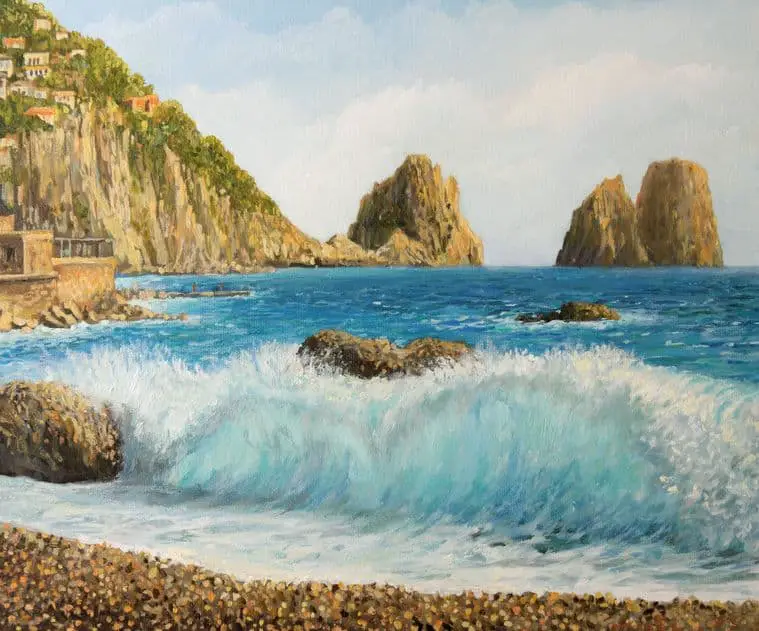
Seascapes have a lot of potential because they allow you to incorporate the movement of water into your painting. While landscapes are static images, if you want to, you can use the churning sea, or the waves as the tide comes in to create a sense of motion and excitement in your painting.
The first step if you want to draw a seascape with pastels is to determine which kind of pastels you should be using. You can use either soft pastels or oil pastels. It's essential that you choose one or the other since they are not mixable.
While you will have your own preference, personally I would recommend using oil pastels if you are drawing a seascape with pastels. They will give you a look similar to an oil painting, and allow you to create wonderful impasto that can really help to bring your art to life.
Sketching your Seascape Directly Pencil or Pastel
The beauty of oil pastels is that you don't really need to start with a sketch. As a medium, they are inherently messy, so if your finished drawing has some errant pastel strokes, it's not necessarily a bad thing.
If you do decide that you want to sketch out your composition lightly before you get started, using a graphite pencil may not be the best idea. Why is that? Graphite is well known for bleeding through both oil paintings and oil pastel drawings.
That means that the initial sketch that you probably intend to fully cover with oil pastel will probably start to seep through the layers and make it to the surface of your painting at some point. Now, if that's something you want, then feel free to sketch in graphite. If not, though, then you should choose another medium to sketch in.
So, how should you sketch in your composition? You have two main options. First, you can sketch your layout in charcoal. The charcoal will not seep through layers of oil pastel. But, charcoal will smear as you draw on top of it.
Fortunately, if you spray a few coats of workable fixative on top of your charcoal sketch, it should fix it in place, allowing you to draw in oil pastel on top of it. Or, you could simply sketch your composition out with oil pastels.
If you want to try something a bit different, you could also use watercolor pencils to sketch out your pastel painting before you get started. One exciting way to add a lot of vibrancy to your pastel painting is to do an underpainting in complementary colors.
This may feel very odd at first, but if you do a light watercolor painting in complementary colors, then apply oil pastels over that painting, it will add another dimension to the colors of your picture.
One important thing to keep in mind, if you decide to add a watercolor underpainting to your oil pastel drawing, make sure that you use a paper suitable for this approach. A good, cold press watercolor paper should work well for you here.
Draw from Direct Observation
One of the main advantages of working in oil pastels is their ease of transport. You can carry a case with you to a location you feel like drawing, and in just a few minutes, you can be set up and will be ready to start painting.
Unlike paints you don't have to bother with water, or acrylic medium, or linseed oil. You just sit down and get to work. So, they get the benefits of a painting, with the ease of set up of a drawing.
When drawing from direct observation, you need to work quickly. Light changes rapidly, and if you don't get your drawing done before that happens, it can really make it difficult for you to get the finished look you are going for. Fortunately, oil pastels excel in working quickly. You can lay down color quickly, blend it immediately, and since you aren't trying to add a lot of details, this speeds the process up a lot.
As an artist, going out to the seaside and painting while enjoying nature is a great joy. Even if you prefer to work in private in your home or studio, venturing outdoors on occasion to paint on location can help you to grow and expand your skills as an artist.
Drawing From a Photograph
Drawing from a photograph is a great way to learn how to draw a seascape with pastels. While you have to work quickly when drawing from direct observation, when working from a photograph, you can take your time. To help you achieve this read my post, 10 Tips For Drawing Water, Waves and Ripples.
There's no need to rush because the light won't change, and you don't have to worry about a storm coming in. If you really want to get the most out of drawing from a photograph then taking your own pictures is something you should strongly consider. Now, if you don't live near the ocean, this will obviously be more difficult. But, if you can take a trip to the coastline, taking your own pictures will allow you to compose your painting how you want to.
Another option when working from a photograph is to use photo manipulation software to change your reference image. You can combine different photos in order to create the composition you are looking for. In case you feel that this is cheating, it's not. Photo manipulation software is just another tool that you can use to bring your artwork to the next level.
Draw the Main Outline of the Sea, Waves, and the Horizon
If you want to learn how to draw a seascape with pastels, you need to learn how to start.
- First, choose the right paper to work on. Oil pastels need a paper that has a good deal of tooth.
- Smooth paper won't allow oil pastels to adhere properly, which will make it impossible to put down multiple layers.
- What paper should you use? Try pastel paper, charcoal paper, sandpaper, or cold press watercolor paper.
- You can also buy a pastel ground that you can apply on other types of paper to give it the tooth needed for pastel painting.
- Once you have your paper chosen, start your pastel painting by making big, light strokes to lay out your composition.
- You aren't looking for details here. What you want are indications of where the sea is, how the waves are splashing, and where your horizon line is.
- An excellent paste drawing needs a great foundation, and that's what you are going for here.
Draw and Observe the Shapes of the Waves
After you have your basic composition sketched out, it's time to start bringing your pastel painting to life. One of the main features of any good seascape painting is the ocean.
Specifically, you should be looking at the shape of the waves so you can learn how to bring that motion into your picture. If you simply paint a flat blue tone down to represent the sea, then you are going to have an artificial-looking painting.
If all of your waves have a similar shape to them, it won't look real either. When water moves in the ocean, there is a randomness to it. Fortunately, oil pastels were practically made for capturing this kind of movement. You can mix bold random strokes into a blue/green base, giving you the illusion of change that can really bring a pastel painting to life.
Beginning with Pastels Things You Need to Know
- When working with oil pastels, there are specific steps you have to take to keep your pastel painting from turning into a muddy mess.
- With soft pastels, it's common practice to work dark to light. It's also essential that you avoid overworking an oil pastel painting.
- Oil pastels are famous for their ability to blend together. But, if you work them too long, they can go from looking well blended to a muddy mess.
- While it may seem like anything you do with oil pastels will turn your painting into a muddy mess, that's not the case.
- Oil pastels are a unique medium, and you need to learn how to use them properly to produce quality pastel paintings.
- Visit Amazon to read the latest reviews and find information regarding the latest sets of oil pastels on the market.
Blending Colors Light to Dark
With oil pastels, you always work light to dark. Always. There aren't a lot of rules in art that can't be broken, but this is one of them. If you try to add light colors on top of dark colors, it's never going to work well for you.
Start out your oil pastel seascape with light sketch marks then gradually start to add darker colors. You can and should go for really dark areas in your painting to create contrast, just make sure that you add those after you have built up your highlights and mid-tones.
Using Paper Templates to Create Precise Edges
Let's say that you have a house, a fence, or some other type of structure in your seascape. Have you ever tried to draw a straight line with a crisp edge with an oil pastel? If not, I'll save you the trouble, it won't work.
Oil pastels are meant for broad, bold strokes, not fine details. So, what do you do if you need to create a straight, clean edge? Use a sheet of paper. Simply sketch out the shape of what you are trying to draw, then use an Exacto knife to cut it out. Now, you have a template.
Place it on top of your pastel painting, while avoiding putting too much pressure which can smear the pastels, and then draw inside of it. Presto! You'll have nice, clean edges.
Organizing Your Colors
When painting a seascape, or any type of subject for that matter, you should try to have a somewhat limited color pallet. If you have over a dozen unrelated colors on your painting, you'd better be painting a rainbow, not a seascape. This article is the property of improvedrawing.com 2021.
You want to stick with cool colors for the most part. But if you are painting a seascape during sunset, then warm colors are obviously acceptable. Just make it a point to try to limit your color pallet, so you don't end up with a pastel painting that is too busy.
Shades of Green, Blue, and White
- Shades of green, blue, and white should dominate any seascape painting that isn't one that features a sunset.
- Make sure that you break up the water by using these three colors.
- When you look at the ocean, you should notice movement, as well as areas of light and dark.
- In order to create interest in your painting, try using these three colors next to one another.
- You can blend them together, but you should also use a light touch when doing so to allow some areas of color to remain distinct.
- The eye of the person looking at a painting will do a lot of the work for you and blend the colors together.
Shades of Red, Orange, and Yellow
- While you should stick to green, blue, and white for the most part, adding a splash of red, orange, or yellow can really liven up a painting.
- When using red, orange, or yellow in a picture that features predominantly blue and green tones, you need to use restraint.
- Think of an area of the painting that you want people to focus on. That's where you should add a touch of bright color.
- For example, you could paint in a single red beach umbrella that will stand out and draw in the gaze of the viewer.
Applying Tint and Shade to Color
How do you apply tint and shade to color in a pastel painting? In order to tint a color, it's best to use a slightly darker version of that color. For example, if you are using one color of blue for most of the water, using a darker shade of blue blended into it in certain areas can add an exciting tint to the blue.
For shadows, you can either use either darker shade of the same color, or you can try blending in a little of the opposite of that color.
For example, you could blend in a tiny amount of dark orange to the blue of your water, creating a darker almost brown like blue color. Whatever you do, don't use black for shadows! Large black areas will make a painting look flat and lifeless.
How to Blend Oil Pastels
- A big part of learning how to draw a seascape with oil pastels is learning how to blend them together.
- High-quality oil pastels will have a soft, butter-like consistency to them. When blending oil pastels, you can create a wide range of effects.
- If you want a pastel painting that looks more like a drawing, don't do any blending. If you wish to some blending, then using a blending stub works very well.
- If you want a painting that looks a lot like an oil painting, then using turpentine will melt your oil pastels and allow you to blend them together like oil paint.
Additional Comments
I hope you have enjoyed reading this post and that you have found it to be informative and useful. For more information on how to draw please visit our home page at improvedrawing.com