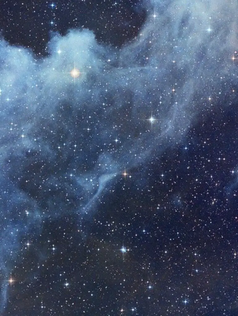
When looking at the night sky in real life, it's hard to see all the colors. Usually, you can see the light transition right after sunset. This is when colors begin changing from light to dark. To emphasize how this works on paper, these colors obviously need to be magnified. If you want to know how to draw a night sky using colored pencils. This extensive guide will take you through several steps and elements.
You will first need to have a good set of colored pencils that allow you to layer and blend your colors. Here is a list of the items you'll need to make a night sky.
• Colored pencil set
Prismacolor is an excellent set, to begin with, but you can use whatever you like if it blends well. Colors should be soft enough to cover each other with little work.
Most drawing paper has a little bit of bite for the pencil to leave more color. I would recommend that Strathmore is a great brand to stick with. Depending on your choice of texture, you can choose between 300-500 series paper.
• Eraser (or eraser gum)
You will need a nice eraser that is effective at removing colored pencils. This can be a task but not impossible if the eraser is natural latex. You can alternately use a sticky gum eraser that picks up the color bit by bit.
• Blending stump (or tissue paper)
A blending stump is excellent for fine detail, but if you have a whole sky, then tissue paper is perfect. You could get away with toilet paper if it's a quality 3-ply brand. Paper kitchen towels work well for large sections.
Related Posts:
- 20 Ways to Draw a Sunset with Watercolor Pencils
- How to Draw a Tree in Watercolor pencils
- The Best Books on Drawing Landscapes
- 10 Tips For Drawing Water, Waves and Ripples
- Sketching vs. Drawing: What’s the Difference?
How to Compose and Draw a Night Sky
So you want to draw a night sky, that's great but how are you going to compose your picture? Just showing the night sky isn't enough because you need to have a grounded point of view. This lets the viewer know that they are looking at a point in the sky from somewhere on the ground. This is where foreground or background objects allow a viewer to visualize their standing point.
Essentially, without having these markers in view, it's hard to let anyone know if you're looking up at a fixed location. These can be visual teasers such as a mountain line, from your backyard, or through a window. You need to create a location where you're located so you can better convey your point. Are you standing under a tree staring upwards or standing on the edge of a cliff facing the ocean?
Please look at this drawing and sketching video course I have created. Use this link.
Each of these visuals also turns into strong emotional responses that make a viewer feel something. If you're an art student, you probably have learned about building emotional reactions. But if you're not, then it boils down to a simple location. Here are some samples that you can choose that follow the same steps
• Backyard moonlight sky
• Forest treetops
• Distant mountain range sky
Draw the Horizon Low In The Sky
The horizon line is a point of reference that is standard for any kind of perspective drawing. The only difference here is that you aren't going to be making a 3D perspective at all. What is happening here is that you need to start with a sightline that establishes your point of view. No matter how you have your paper laid out, lengthwise or vertical, a low horizon line will always have the establishing line. This is first drawn at the lower section of your paper.
Use a ruler to make this more manageable if you don't have a steady hand. This can be drawn using a light line with a grey pencil but not totally black. It's a reference line that will be filled in later. It gives you a proposed horizon where the bottom of your sky will be. Since the sun always goes down, this line will be much lighter than the upper portion of the showing sky.
This helps create a multi-layered effect that gives any viewer a clue that it may be getting darker. Anything above this line is going to be your night sky and can contain many shades of colors. But these colors will all directly relate to where you place your moon that is showing.
Placement of the Moon
There is nothing more important than to bring attention to the center of your picture. The reason is simple since you don't want the eye to wander around the picture too much. Having the moon centered in the picture also makes it more of the focus you want to highlight. Looking at the horizon line you've drawn, look at a spot on your paper that will give the moon a central spot.
Now the next step is determining how large the moon should be. As we all know, the moon is often larger as it appears on the horizon. In pictures, this is suspended since there can also be an element of fantasy and mystery. As a rule, don't exceed more than 2 inches diameter for your moon on a 9×11 size paper sheet. You can use nearly anything to trace a faint line around a coin, bottle cap, or button.
As long as this is placed within the paper's central location, you can't go wrong. Now you can start to assemble all the colors that will start to flesh-out your night sky. You won't need more than 5 colors in all for this next task.
Reflection of LIght
The moon is a source of light that is reflecting light back to the earth. It's actually the light of the sun shining on the moon from under the horizon line. You'll notice in real life that the moon reflects a lot of light through the sky and will look as if it's glowing! In some cities where there's too much air pollution, you can see the light halo effect. Anywhere that light radiates from a full moon, the reflection radiates outward like the sun.
This makes it easier to outline any objects that are in the background or foreground. The closer an object is to the front of the picture, the more generous the light reflection is. Yet when things get more distant in the background, you do the opposite. This shows that the reflected light only travels a shorter distance when things like mountains are far away. The top center is the strongest point and gets weaker as it reaches the edges of the paper.
Depending on which sample picture you decide to draw, the moon's background object light reflection is always weaker. Just enough to be seen but not taking away your attention from the foreground detail.
Full Moon Scene as Opposed to Half-Moon Scene
A full moon is a lot easier to draw, let's face it! With a half-moon drawing, you need to think about the angle of light from the sun below the horizon. This is a bit tricky to pull off unless you've been studying 3D drawing and perspective. As the moon goes through its' monthly cycle of phases, the moon isn't always a perfect crescent moon. This is technically called the waxing crescent and is seen before the 3rd quarter and after the 1st quarter.
While these are striking looking images, there is often too much artistic license that ruins this type of moon. The other problem is that you need to know where the moon's light reflection is angled. I strongly advise that you research the phases of the moon and how each crescent cycle is different. If you make a lighting mistake here, your picture will become vague and not so accurate looking.
Unless, and once again- if you are drawing Manga, fantasy, or cartoon-inspired moon drawings. A full moon is better to start with is simple, a full moon is interesting. It's mysterious and powerful, with the power to affect many things when it appears. It's also a classic image that has always been intriguing for people to look at.
Drawing Clouds and Shadows
Adding clouds into your picture is always a nice touch because this adds realism to your picture. If you do it right. The secret is following the radiating flow of light that's around your moon. The closer that clouds appear in the foreground, the more edge lighting around the cloud can be seen. With distant clouds, the reflection will be on the top edges only and along the extending rims.
A rule about clouds is that you don't want to completely cover your moon either. Give some accents here and there as if night clouds are cruising along slowly. Stormy clouds will look darker and have ominous looks and shapes. Since there are different kinds of clouds, decide on the type that appeals to you the most. When the moon is behind them, there will always be darker shadows below them.
This helps to build a three-dimensional illusion that makes a night sky drawing enjoyable and calming. It can also do the opposite if you mean to make the viewer feel insecure or worried. Clouds in any picture add emotions that are often subliminal if they are done well. You just need to find the reason why the clouds are in the picture in the first place.
Drawing Silhouettes, Shadows and Trees
Here we get into the little details that mostly show a dark shape in the foreground of your drawing. More appropriately, these silhouettes are easy to get away with. They are masked-off shapes that represent what you can see in front of you. These don't need to have so much detail, but the highlighting rules will make a significant impact. As moonlight is coming from directly overhead, your big task is all in the highlight details.
Starting with anything that's at the center of a picture, these images are mildly tricky. The top leading edges need a color that pops immediately but slowly blends over the top edges into the silhouette black. Anything off to the left or the right side will have side lighting. This applies to trees or objects. You have to follow the radiating light that comes from a circular pattern caused by the moon.
Another nice effect is lining any light highlight with a light purple just under the highlighted line. This can graduate into a darker purple and finally into a black shadow. Using a blender stump, these can be further blended. The light purple makes the UV aspect of how light shines look more convincing on your picture.
How to Color a Night Sky
Your picture isn't going to be a cookie-cutter project since you'll need to consider a few good questions first. And not everyone lives in the same part of the world if you're reading this right now. So before making any kind of drawing, ask yourself these three questions.
Which season is it?
Seasons change, and each one has a characteristic hue for sunsets and the onset of night. Summer has warmer golden hues than winter. You're likely to see more blue coloration in the wintertime. Take a lesson from the Bob Ross legion of painting fans. Stick to a season that has colors that reflect your night sky.
How soon after dusk or dawn is it?
Right after the sun goes down, colors begin to fade rapidly, and you can clearly see nighttime colors. It's a combination of blue and purple as the horizon light slowly drains away. We can't see the infinite amount of night colors due to light pollution in our cities. The stunning colors of the Milky Way are enough to make most of us gasp in shock.
What part of the world are you in?
Perhaps you're one of the lucky ones that live in a place where the Northern Lights are visible. If that's the case, you should add this element to your picture too. It's the little personal touches that make your picture unique. Your imagination is the only landlock that might keep you from having a good idea.
Organize Your Color Scheme
By now, you have a pretty good idea of what colors you can see in your night sky. If you don't, here's an example of colors that never fail. Use many varieties of blues and purples. If there is a moon present, you can use a series of yellows around your moon mixed with light blue. Watch out that you don't mix the yellow and blue as this will make green. Lightly blend these joining colors, so they are separated and not muddied.
Depending on your location, the gradual colors toward the horizon line will always be lighter. This gives just a hint that the horizon is where a light source used to be. Have your primary sky colors starting from light blue to dark blue. You can mix black towards the upper portion of the frame. Just don't wash-out the dark blues' effect and instead replace them with light washes of light to dark purples.
The purples you use are neutral tones that help give any blue color a richer appearance. The further north you happen to live, the deeper these colors tend to be. If you live closer to the city, the horizon line will reflect light back into the air, making a horizon line glow more apparent.
Don’t Just Use Black
Although this is a total ‘noob' mistake, it's not common that a night sky is totally black. You have to create layers of color, as this is how the atmosphere works. It's composed of many layers of gradual colors that go from dark to light, downward to the horizon line. Once you start adding objects that have reflected light (like the moon), this also changes. This doesn't mean that black is off the table; it just matters how much you use it in your picture.
When moonlight appears as part of your night sky, the right combination of violet and even some dark greens helps. This can give a halo-like effect of the moon's glow thrown-off more visual appeal. This is especially so if the night air is a bit misty or has moisture after a rain or chilly nights. Save the black for silhouettes and objects that are closer to the front of your picture.
Even then, the addition of deep purples and violets within the black can help enrich a dark shadow. Not until you start getting light reflections from overhead moonlight will you need to help develop 3D shading tricks. In this case, less is more, so you can add highlights as you feel is necessary.
How to Blend and Create Depth With Color Pencils
Your first pass is going to be light strokes to lay down the first layer of sky colors. The reason you do this is so you have layers of color that are somewhat dimensional. I know that colored pencil isn't so translucent, but the trick to using them is layers laid onto each other. The subtle color layers appear as if they are further in the background. So the first layer is going to be the softest of color blends.
You might try making the same picture a couple times so you can see this difference. This can be tricky if you have a moon in the center of your picture. So try one with and without a moon present and see how that changes the background colors. Even a night sky with no moon showing will still have some play with light and shadow. It also depends on how much horizon light or light pollution is coming from a nearby city.
The number of layers you add will eventually build-up and make for a better illusion. Just like drawing human skin, it's not easy to replicate translucent surfaces. This is all done through careful highlights and color layers. Think of your night sky like human skin if that makes sense.
Begin With The Sky
Even though the sky is your background, you have to start with the colors filling your sky. Most of these colors fill the entire page, at least the part where your horizon line starts. So this area is marked above the horizon line, and the top of the page will be your main work area. Start with drawing the lighter colored line that is no more than 1-1 inches thick. The next line will be a darker color line. This is repeated until you have the darkest color up top.
If you add a moon to the center of your picture, you'll need to radiate these colors outward. These will begin at the outer edges of the moon diameter to the edges of the page. If you are very careful, you can try a combo of these two methods for stunning results. But the very first color layer needs to be light so you can add more layers after that. Some of the color separations don't need to be blended so evenly either.
Sometimes the air has different layers that have clouds that are at odd angles. This might give you a good cross-wind layer that gives even more dimensional qualities. These cross-winds need to start off high in the upper left or right corners and travel downward towards the horizon line.
Mask Areas of Your Drawing
If you already have an idea of the silhouettes you want to use, you can create temporary construction paper masks. These can be taped-down using Post-It notes so you can see how the positioning is looking. With each layer in the background, you'll need to blend-out each layer. Now at the beginning, the first couple of layers will have more texture because of the paper you're using.
Smoother paper is fine but something with a little bit of tooth, this is better for your color pencils. You'll need to use tissue paper or paper towels to blend these colors and rubbed into the paper. The first layer will be covered by another and then another, giving the background a 3D looking quality. When you've completed at least 3-4 background layers, you don't have to rub these down to be soft looking.
This is how the background colors will work together. The softer colors in the first layers will appear to be further away, while broad color lines look closer. If you want to nit-pick these sharper-looking lines, you can use the blending stump. Then you can begin tracing out your silhouette lines for coloring them in. Use the construction paper as a guide or draw the silhouette freehand.
Apply Pencil Horizontally Across The Page
Among the various techniques that you can use for coloring is the horizontal line method. It's simple rubbing the color over the paper at an angle so that you leave a single layer of color. Within a series of semi-straight lines that are repeated at least a hundred times, you'll get a layer of color. This can be blended using a tissue, so each color layer is burnished nicely into the paper. This can also fill small gaps and pits in your drawing paper.
As you get to transition colors, you need to be more careful to not make them turn into strange colors. Blue and yellow colors are notorious for becoming green, so you don't want moonlight to lean toward greens. Blend these using a blending stump.
Aim For a Thick Consistency of Color
Only after you get to the first couple of layers blended in the background will you go thicker Color pencil is easy to rub off onto clean paper unless you have a softer hardness. What you'll want to be continually paying close to attention is the consistency of your color. All the layers involved need to give you the visual impact without the picture looking so flat. You eventually want to have the viewer thinking they are looking into the picture.
Keep your color pencils sharp, so you can still have nice even color lines that are still pretty thick. If you have to soften them later, it's up to you. This is why you should have stencils of your objects to use as background reference.
Graduate Colors From Dark to Light
Any nighttime color pencil drawing needs to have colors going from dark to light. If you just sit and watch the sun go down, you can see why this happens. But even in the middle of the night when there's no horizon light at all, the sky has gradient colors. I have to admit that not every night sky all over the world is the same. So you need to pay attention to the seasonal effects that change the night colors ever-so-slightly.
An excellent tip is to collect night time photos from the internet of all sorts of night sky angles. These make good references and help you map-out your drawing faster. It can also be a visual aid when combining separate elements too.
Layer Variations of Color On Top of Each Other
Give your night sky plenty of colors, so don't be afraid to push for a color that you like. This can make your sky have character. As I mentioned before, the multiple layers of color laid down in the background give your picture ambiance and depth, just like how Disney artists utilized the multi-pane background layers. It just gives any background a sense of focus where there typically isn't.
This isn't an advanced technique, but it does lend to your ability to effectively put several layers onto the paper. It also increased the value of the night sky more when it looks near photo-realistic. Pay attention to the temperature and weather pattern your picture is experiencing. The more the viewer believes it's real, the better you've done your job.
How to Draw Stars
Stars are going to be the very last touch that makes your night sky interesting. It can be before adding shadows, but I don't recommend it. The added little bumps of color dotted around your shadowed areas might show through. While this is fine for texture, it can affect the dark silhouette you intended to keep dark. When starting to add them, you'll need a very sharp white pencil that leaves little specks.
You may also want to add hints of light such as rusty reds, emerald greens, or light orange. The atmosphere plays tricks with the light and can make some stars discolored. Even the shape is not depending on a perfectly round point of light. Unless you decide to blend the first layer (or blanket) for more dimensional effects.
How to Create Realistic Stars
I'll offer you one last tip, which is one of my all-time favorites. It's often called the sandpaper trick and makes a lot of starts very quickly. What you'll need is a used medium grit emery board. Take your white pencil and start to sand at the tip along the edges. These will start to scratch-off little tiny granules onto your paper. This is a delicate procedure, so sneezing is just not an option.
Brush away any granules that aren't supposed to be in the darker silhouettes or shadows. When you feel you have enough stars, then wait for the fun part. Take a simple piece of silicone baking paper and carefully lay over your picture. Use a rolling pin or anything that will smash these little granules into your picture. It takes patience, but the compression deposits the color pencil onto the drawing surface.
If you have any stray white spots, you can scrape them away with an X-Acto blade edge. Now your night sky drawing is completely finished. I'm sure this won't be the only way you'll learn how to color a night sky, so practice makes perfect. Good luck!
Create Art With My Favourite Drawing Resources
General Drawing Courses. I like Udemy if you want to develop your knowledge of drawing techniques. Udemy is an excellent choice due to its wide range of creative courses and excellent refund policy. They often have monthly discounts for new customers, which you can check here. Use my link.
Sketching and Collage. Take a look at this sketching resource I have created. Use this link.
Proko. Is one of my favorite teachers who surpasses in the teaching of Anatomy and Figure drawing. Prokos course breaks down the drawing of the human body into easy-to-follow components aiding the beginner to make rapid progress. For this, I really like Proko.
Art Easels. One of my favorite ways to draw is by using a drawing easel, which develops the skill of drawing on a vertical surface. The H frame easel is an excellent vertical way to add variety to the style and type of marks you create when using a drawing board.
To see all of my most up-to-date recommendations, check out this resource I made for you.